How I Created My Portfolio Site Using Kadence Theme and WordPress
Hello and welcome to my first post on the Tdot Connect site. I’m really excited to share some insights and tips on the topic of how to create a portfolio site on this network.
First of all, you’ll need a premium membership which comes in two flavours: Plus and Pro. You’ll find they are similar – both offer access to courses and a site. However Pro includes a second additional site and up to two hours of tech or creative support (I will assist you with web design or lead you through a portfolio review or some combination of both).
Let’s get into it by reviewing the tools you’ll use:
- A WordPress site on this network
- Customizer and page edit settings
- Kadence theme (select from options / appearance)
- Full width pages and rows
- Gallery with lightbox enabled
This post assumes you have already registered for a membership and have Kadence theme enabled.
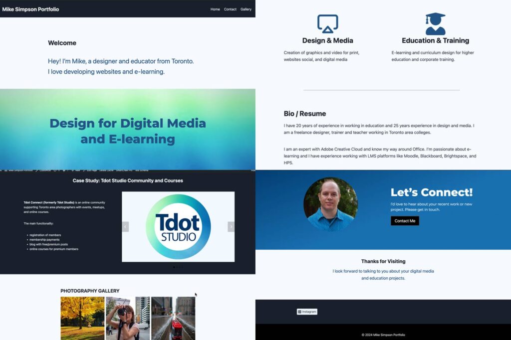
Let’s look at some of the parts of the website from top to bottom. My site is here: mikesimpson.tdot.co – it’s a work in progress but I like the layout, the pages and the gallery.
Here’s a visual preview of some of the main sections of the site. I am really liking the power of contrasting dark and light colours. Unlike a typical template at a service like Squarespace, for example, this custom site has alternating colour fields – black, green, white, blue that give it a really dynamic, colourful and visually strong look.
Here’s an index to the important content on this page:
Example site 1: mikesimpson.tdot.co
My personal creative portfolio site was one of the first sites on the network. I created it as a test site, to make sure everything was functional from the design blocks to the contact form and image galleries.
I do have other websites, and some are for my education work or for the Tdot projects, but this micro site has been a blast developing and I am excited to share a bit about the design and some main features.
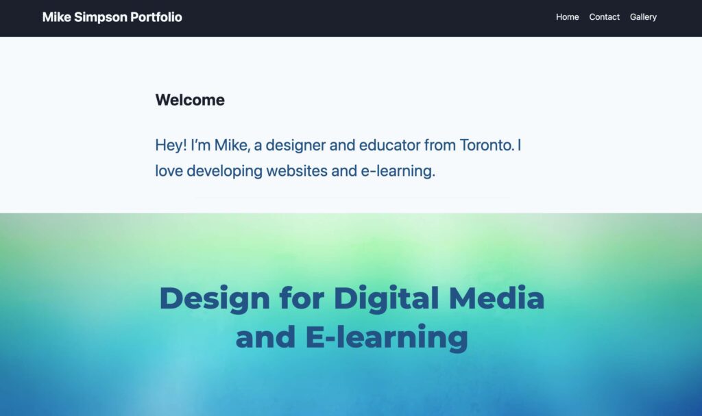
Full Width Design and Hero section
There are 3 small sections at the top of my site, as seen in the screenshot below. These make up what could be called the “Above the fold” or visible part of the site if you view on desktop.
- Navigation and menu
- Hero section
- Video background
This is the most crucial part of any site. Most would use images here but I opted for minimal approach. There is a video in the background though which is snazzy. Unlike on most sites I created I didn’t add a logo. However many creative people do have a logo so be sure to add it if you have one (add logo via “Site Identity” in customizer settings).
Let’s review a quick concept for web design. One principle you should now about is the idea of “boxed” or “unboxed” layouts.
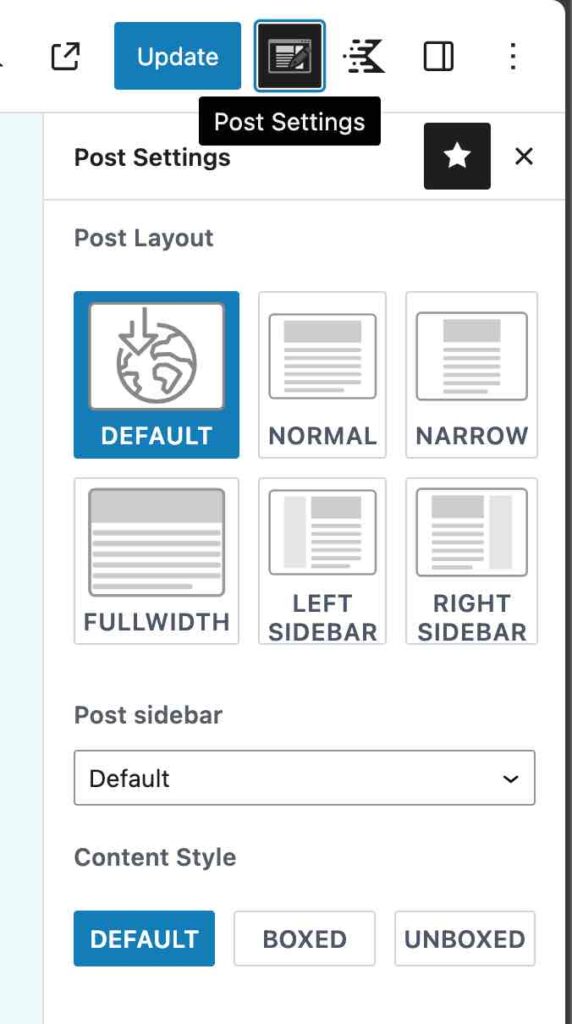
If you look at the right sidebar settings panel you will see that Kadence permits different options for displaying the width of a content (from normal to narrow to fullwidth), options for sidebars or hiding header or footer, and options for displaying content “boxed” or “unboxed.”
My site is unboxed. It stretches full width from left to right. If it was boxed there would be a clearly visible central content area with left and right sides and a drop shadow effect around the middle content box.
Try the boxed and unboxed settings to see how this changes your layouts. Sometimes this look is appropriate. Sometimes not.
Example site 2: iconictoronto.ca
Often a hero section has a large background image like you can find on the main page of iconictoronto.ca, but I have opted for a video background. Yes, take a look and over a few seconds you’ll see the gradient shift as the video goes through the whole loop.
Side note: the iconic Toronto site (mentioned above) also uses Kadence theme. The top section uses a photo slideshow and transparent navigation to achieve this cool look.
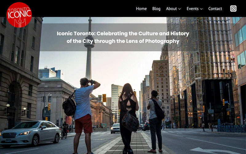
iconictoronto.ca background animation
This homepage uses a full width background image with slideshow enabled. The site has a 6-image rotation.
If you are a photographer or photos are important for your site, this approach would really engage your visitors.
Iconic Toronto is a specialized project site that was created to profile classic architecture, public spaces and neighbourhoods of the city. It was the focus and theme of a Tdot Shots photo contest in 2022.
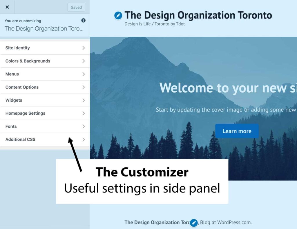
Tool 1: Use the customizer to edit your site settings and design/layout
The first key to editing your site is to recognize the power of the customizer. A theme like Kadence packs many of its features into this incredible sidebar panel.
Here’s a look at the customizer in a normal WordPress.com site. It’s simpler than Kadence but gives you an idea of what elements can be controlled. You can edit important parts of your site like the site title, site logo, colour scheme, typography (fonts) and basic page layouts.
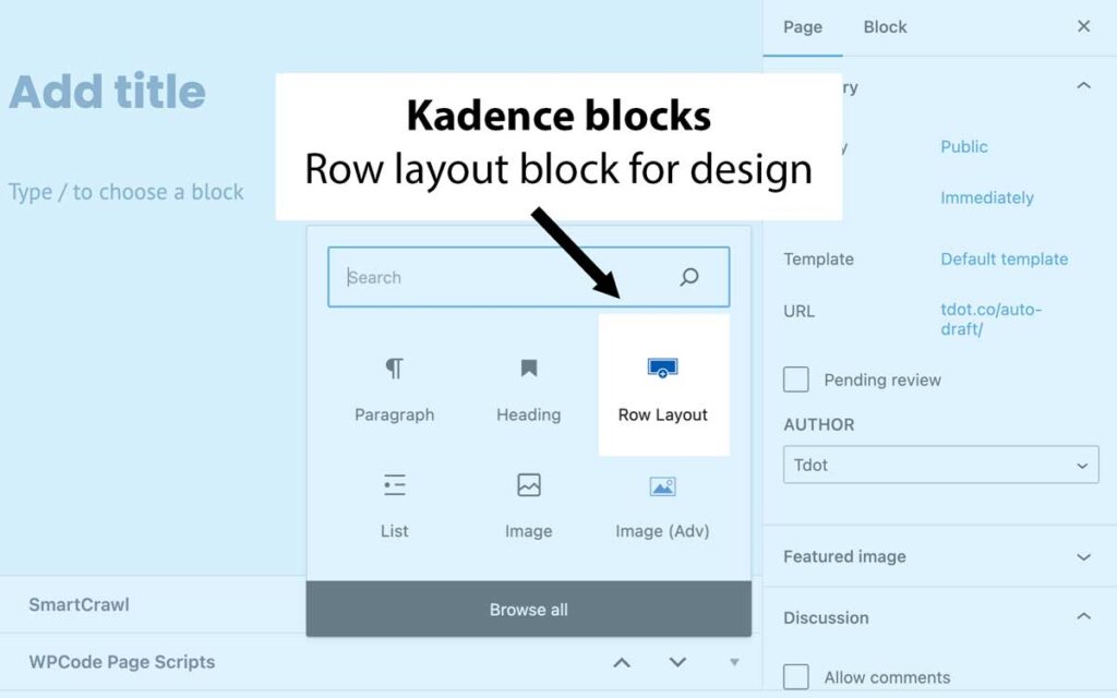
Tool 2: Full width sections and rows (Kadence blocks)
One of the key elements is the full width rows which I also refer to as sections (technically Kadence calls sections the sub-organizational elements of rows). When you use the WordPress blocks and the Kadence blocks builder add-on, you’ll see an option for the “row.” This is a very special layout tool
The row tool shows you various layout settings including single, double or triple column layouts (and there are more). Most often I use single column rows. The trick really is to employ the full width aspect.
Here’s an example:
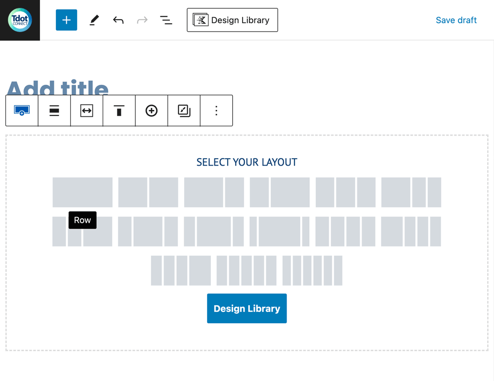
How about the next step? That involves viewing the column options in the block. This is called “Select your layout.” In the animation below there is also an option called “Align.” Here we can choose “Full Width,” which is the perfect setting to create a full width section.
What’s the potential of this? Well, we can create truly stunning layouts for desktop, and have these blocks reflow on mobile. In the next part you will see an example of a full width row with a dark background and some content that really has some visual pop.
One thing I have done throughout the site is alternate the colours used in the rows, and alternated the background content – using colours, gradients, and images or video.
Kadence blocks row layout with two columns
HEre’s a section (row) from the lower part of my site. The basic construction was made with a “row layout” Kadence block with two columns. I aded a gradient background to the row. A photo with a circle mask and some call to action (often called “CTA”) words and button sit at the right.
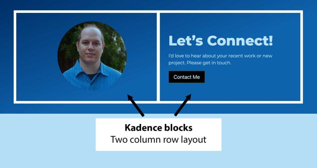
In the image above, I show how a typical two-column row will look. Often there is an image on one side and text on the other.
Apple uses this design quite often. As you scroll their page, the images and text switch positions from left to right as you scroll. To make the page design even more sophisticated consider adding animation to the elements which appear as you scroll (fading in for example).
Summary
I hope you find this useful. Though I have created a modern site with a fairly conventional layout, you may have some success with a similar approach. However with the sophisticated tools of Kadence theme and blocks there is no limit to what you can achieve.
Some people think you need a plugin like Elementor to pull off rich layouts in WordPress but Kadence truly blows my mind with its capabilities. Note I also use regular WordPress blocks for some type elements and images. Kadence theme and blocks allow you to create a wholly customized site or use pre-made elements for a quick start. You can avoid a generic look by doing some basic customization.
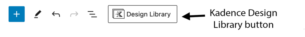
Keep in mind that although I built my site from scratch you can play with quickly adding different kinds of content from the “Design Library” that appears at the top of the editor if you have Kadence installed and activated. In other words, there “patterns” available with pre-built block combinations (these are templates), and working with them helps get an idea of what is possible.
Here’s a screenshot of the Design Library – found at top of the editor.
Handy tools exist throughout WordPress. Explore the options and play with your designs. You’ll find some incredible options within the basic WordPress themes and blocks and more expansive options within Kadence theme and blocks.
Have fun creating your site!